In this last installment, we are listing more of the features—and rationales behind them!—of the 2023 Powerpoint template.
We’re including Learning Objective icons on the Objectives slide and encouraging faculty to add them to the corner of individual slides. How come?


The Objectives slide is a required element in all session materials, and the LO icon is something students have asked for in evaluations. It is an immediate clue that the material on the slide pertains to LO #1, or 2, or multiple objectives. It helps students study for exams because they can quickly scan through the presentation and know where to focus their attention when they see the LO icons on the slides. It also helps faculty review, organize, and evaluate their materials to insure they are addressing all of the learning objectives in their sessions.
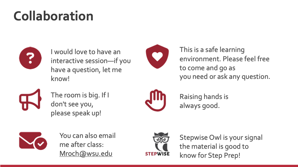
There is now a Collaboration slide. Why?

This is an idea that has shown up in various systems and threads in multiple ways. We took what was already being used and standardized it for consistency and reliability for the students. This sets expectations for the students about how the session will be run.
universal design
This is also the start of some Universal Design elements such as classroom norms, a safe space for sharing; showing vulnerability; asking questions; and/or ability to leave the room, stand, sit, etc., as needed for learning/breaks/ accommodation needs, etc.
There’s no banner with the College of Medicine logo across the top of the slides anymore. Why?

We removed it so there would be more real estate on the slide for content. Also, content running over the banner is distracting and hard to read. WSU requires branding on our title slide and final slide, which is why they are required elements. Otherwise, the logo and branding are not needed on individual slides. Template theme colors are also WSU branding colors, which is why you’ll see a lot of gray and crimson with splashes of blue and green here and there—which is also in WSU brand standards.
Case slides have a gray background or an image of a person. What is the point of that?

This is example of consistency in action on a wider scale. The Case slides all have unique gray background and/or an appropriate Adobe Stock image on them. This accomplishes a few things:
-
- It aligns to how cases look in CBL. The formatting is similar, right down to the header on the slide. This builds consistency between FMS and CBL courses and, again, builds reliability and predictability for our students. They know what to do or expect without being explicitly told via text because the consistent visual clues of color and formatting have trained them to just . . . know.
- It personalizes the case. Case studies are simulated patients—not just a science problem to solve. It is a reminder that this exercise is about a human’s health, and not just their disorder or disease.
- It aligns to how cases look in CBL. The formatting is similar, right down to the header on the slide. This builds consistency between FMS and CBL courses and, again, builds reliability and predictability for our students. They know what to do or expect without being explicitly told via text because the consistent visual clues of color and formatting have trained them to just . . . know.
Conclusion
We’ve all been in situations where it was hard to understand something because of how weirdly a page, slide deck, or multimedia experience was designed: too much text, not enough, crazy colors we can’t actually read, videos that we can’t play, audio we can’t hear and has no captions . . . .
Design makes a difference. It might make THE difference whether materials are even utilized by students.
Your instructional design and digital publishing team is here to help you—in fact, it is what we love the most! Working with subject-matter experts, discovering how we can help, which technology and design will work best: that is fun for us! We are here to help our faculty shine, and we love to help our students learn.
We have over 80 years’ experience in design, publishing, technology, project management, consulting, and adult learning. Everything we do is thoughtful, considered, tested, and reviewed before it goes out the door. Whether you are student or faculty, please let us know how we can help, and we will be very happy to do so!
Read more in this series
The Powerpoint template, part 1
To kick off our Instructional Design series, we want to introduce you to that most ubiquitous tool in our arsenal: the PowerPoint presentation.
The Powerpoint template, part 2
In Part 2 of our series, read on for some of the features—and rationales behind them!—of the 2023 Powerpoint template.
