The goal of the Digital Publishing and Instructional Design team is the unification of learning materials from across the College of Medicine curriculum, reducing the cognitive load so that students can spend their mental energy on learning the principles of medical and scientific knowledge.
We create beautiful materials—visually and functionally consistent—that span all four years of undergraduate medical education, including a comprehensive Gross Anatomy hub that includes an anatomy textbook, dissector, and anatomy review; Clinical Skills; and clerkship Global Health and Virtual Neurology courses. Tap the icons below to learn more!
I want to thank you for your beautiful work on the Microaggressions module. It’s BEAUTIFUL! The faculty I work with in IPE were blown away. Thank you for creating such an interactive module for students.
Skye McKennon
Associate Professor, PharmD, BCPS, CSM-GEI
See a sample of our great projects.
Get to know all of us!
Let's start with over fifty-five years of combined publishing experience.
Spoiler alert: Good design leads to good instructional design!
Some fun details: The fonts, backend information, etc.
Portfolio
It is hard to choose a sample of our many web projects—they are all triumphs in their own way—but here are some that represent the broad range of our work.
When your work speaks for itself, don’t interrupt.
Henry J. Kaiser
The Medicine Digital Learning website
The Medicine Digital Learning site was created to serve as a consistent location for students to access online textbooks and materials created by our faculty. We have different categories of materials—from digital textbooks to online magazines (serial installments) to collections of links, all with cohesive format and function.
500+ published pages
Materials for all four years' of students, plus faculty, preceptors, and facilitators
Global Health is a well-rounded course that incorporates quizzes, opportunities for the student to engage with the material. It also accommodates different styles of learning, with videos, podcasts, articles, and chat prompts.
Dr. Joanna Breems
Asynchronous
Year 4 course
10 modules, including 3 case studies
Planetary Health is a pre-clerkship course that started as a series of Powerpoints, with great content but no cohesion throughout. We put the materials all in one location, and worked to format them consistently so that they feel like a complete package of learning content.
Dr. Anne Grossman
Pre-session materials
Years 1 and 2
9 modules
Microaggressions is a single interactive module that takes students through a range of scenarios. Mini quizzes are included throughout so that students can gauge their understanding of the topic.
Dr. Skye McKennon
Pre-session materials
Interprofessional Education (IPE) session
1 module
Molecular Biology and Chemistry
Molecular Biology and Biochemistry contains 24 sessions' worth of clearly written, well organized materials, including concise answers to learning objectives, reading guides, one-pagers, and mini quizzes so that students can assess where they are in their understanding of the content. This is one of the first of the Year 1 students' courses. Having their materials neatly packaged and linked to from E.Flo MD is particularly conducive to engagement, at a time of significant transition and a steep learning curve.
Ted Chauvin, PhD
Pre-session course materials
Year 1
25 pages
OB/gyn and Reproductive Health
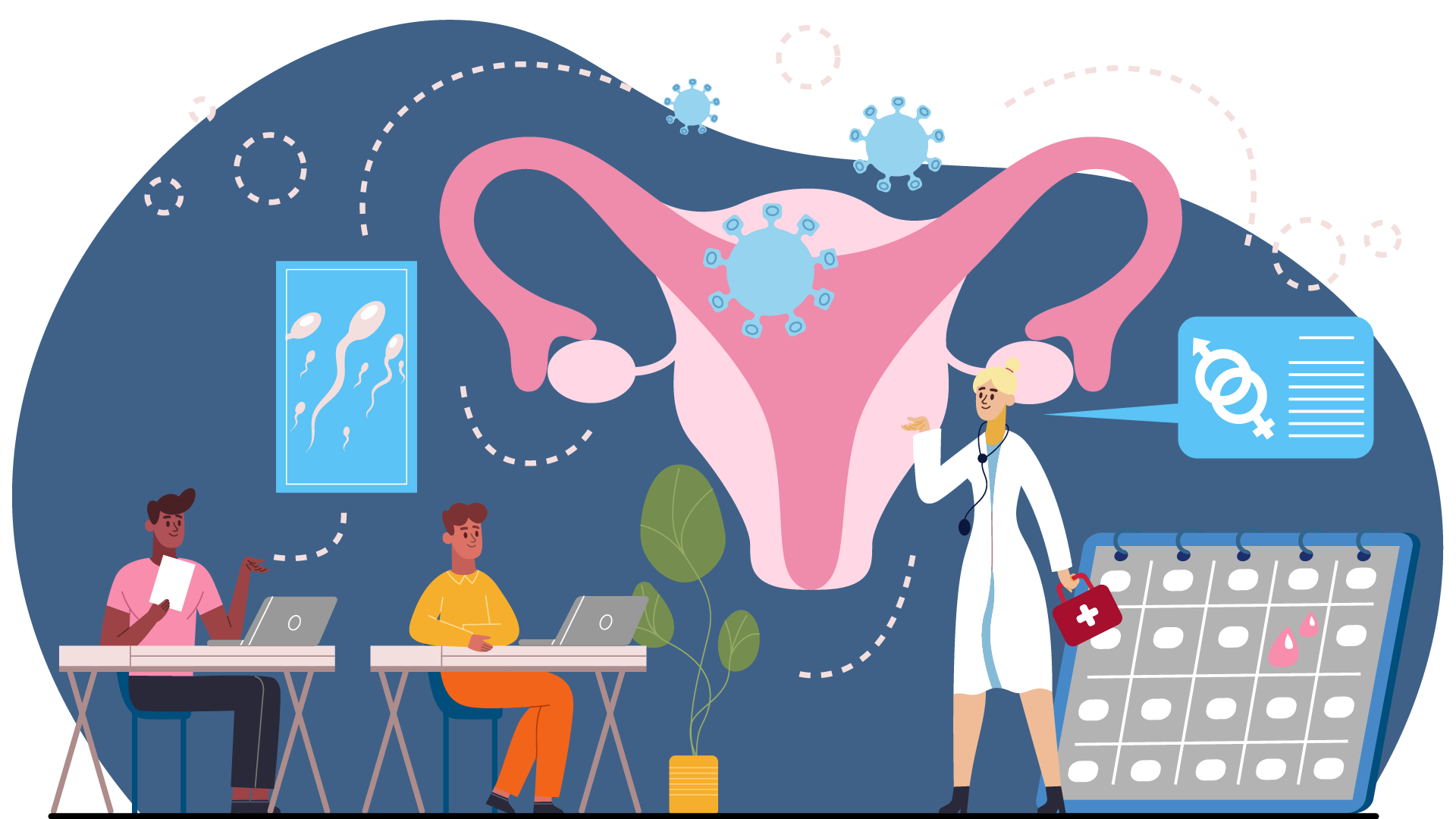
OB/Gyn and Reproductive Health is a resource for all students, with female reproductive lecture material from all four years of medical school, as well as links to recommended e-textboooks, videos, podcasts, apps, and websites. Additionally, there is a downloadable resource with templates for Ob/gyn notes and presentations and resources for those interested in Ob/Gyn as a career.
Dr. Dawn Kopp
Reference materials for all students and preceptors
34 pages
Read more about our projects at the ID + DP Monthly.
The Digital Publishing team
The Digital Publishing team is in the Office of Curriculum, and we work closely with members of the Office of Technology and the department of Academic Operations.
I came to the College of Medicine in 2017 as the designer of the Case-Based Learning iBooks and the eight-volume Gross Anatomy series (I truly love long projects—the anatomy books, at 1,100 pages, were my ninth 700+-page project). Since then, my role has expanded to being the manager of the digital publications team and overseeing instructional design. The collaborations among our team and with faculty bring me real joy!
Speaking of big projects: the MedTech site is where the team started to come together. It was a great collaboration (read more of the history here: Nimble, efficient, and awfully complicated: Building a website for the Office of Technology, Part 1 and Part 2) and the first step in Digital Publishing moving into creating websites.
I have been working in publishing since 2001 and have edited and designed hundreds of books and journal issues, 98 percent of which are on topics related to the development and exploration of the American West (think gold rush, Oregon Trail, railroads, with a lot of Mormon history and California history). I still do history-related projects on the side, most recently a 1500-page biography of Mariano Guadalupe Vallejo.

I’ve been in the publishing world since 1996, as an editor, writer, designer, and finally a creative manager. My previous work was at the number one children’s book publisher in the world, with my Zombie Apocalypse Survival Guide as a favorite with kids. In a fun way, it taught kids about health and medicine.
After freelancing and helping indie authors create 100+ books, I was ready for a new challenge . . . enter the College of Medicine. I started here in 2022 as a designer of the MedTech website and Case-based Learning.
Now I’m thrilled to be making magic on the Learning Site, as we bring your learning materials into one space. My forte is taking the rough learning material, finding the patterns, and putting the material together in a cohesive, consistent, visually pleasing, and interactive way. And if I can make it fun for you . . . it's a success!

The good design and structure of material that is integrated into all of our digital publishing work also plays an important role in good instructional design, which is where Amy Denman comes in!
I work in the Education Technology department and have over twenty-five years in consulting, leadership development, and project management experience; ten of those years were in the adult education and technology sphere, building online courses and system administrating learning management systems.
I want students to have a solid and equitable framework of resources and materials that support their learning in the best, most helpful way possible. I’m striving to make learning materials reliable and easily consumed, while also supporting our faculty’s individual approach and curricular goals. I enjoy the creative problem-solving that comes with this job and marrying different viewpoints—the faculty and the student perspective together.

Academic Operations
We can't omit our partners on the Web Dev team—particularly Danielle Conti, the front-end developer who makes all of our work possible.
We are nothing without our authors! See our portfolio to see the work that we've collaborated on. We'd love to work with you, too. Please get in touch!
Why work with us?
The short version
We are here to make faculty look good.
Imagine: Students absorbing your wisdom through superb digital content.
We can take care of this for you.
The Digital Publishing team digitizes your content and shares it via the web and other digital platforms. With decades of experience in publishing, we love this kind of work!
You don’t have to be a web wizard or an expert at formatting Word documents—give us your knowledge, and we’ll weave it into a beautiful and well-structured website, presentation, or eBook. We’ll:
- Fix the fonts so the text looks perfect.
- Format all of the images and diagrams to look consistent.
- Add interactivity and multimedia when it suits.
eBook design and production
Information architecture
Page templates, layouts, and design
User interface and experience
Learning module creation, design, and hosting
Copy editing
Our projects have an intuitive, consistent look and interface, so students can effortlessly dig in to their job—learning.
Everyone wins!
You don’t have to fuss with documents, your materials look better than anything on ClinicalKey, and your students can carry on . . . absorbing your brilliance.
Instructional design
Spoiler alert!
Good design leads to good instructional design! Richard Mayer’s Multimedia Learning breaks down the principles that we consider when designing our learning resources:
Reduce extraneous processing
coherence, signaling, redundancy, and contiguity principles
Manage essential processing
segmenting, pre-training, and modality principles
Foster generative processing
personalization, voice, and embodiment principles
We can take care of this for you.
The Instructional Design team integrates digital resources, content, design, and instructional techniques to deliver an innovative all-digital curriculum. We can help you structure materials and teaching methods to create the best learning environment for students; moreover, we assist faculty in learning how to use the technology that students use to study (and also expect to use in their courses). Faculty who work with the Instructional Design team don’t have to be experts at Zoom, digital whiteboards, or E.Flo MD—we:
- Learn what you're teaching.
- Help you decide the best way to deliver it.
- Advise how to make your classes more interactive (and therefore well attended), whether in person, hybrid, or remote.
Copy editing
Content curation
Design and production
Learning module creation, design, and hosting
Instructional strategies
Infographics, image search, and licensing
Perfection is always the goal, and it is rarely achieved, especially on the first round. We do our best, then revise and iterate for the next year.
We strengthen your learning materials so you shine as the expert.
The goal of the Instructional Design team is to help strengthen our faculty’s work by identifying areas where including technology would help, or by reviewing your materials and making sure they look consistent, function well, and accommodate a range of learning styles.
We want you to focus on teaching and stop wrestling with formatting.
Our faculty create the content they want students to learn, and we make it cohesive with the rest of the curriculum, and thus easier for students to master.
Faculty can shine as experts in their field, while we take care of making the materials look appealing and the teaching look high-tech and effortless.
We'd love to work with you on teaching and learning materials.
About this site
Let’s talk fonts
Students and faculty need materials that look and function consistently—so they can spend their energy on learning, not wondering how the textbook works or hunting for books.
Just because it is utilitarian, though, doesn’t mean it can’t be beautiful, right?
Alegreya is the typeface for the Medicine Digital Learning site and all of our ebooks. The serif variation is designed for literature, which makes it a pleasure to read. Of course, our material is more concrete, but that doesn’t mean it should not look appealing—think of the volumes of illustrations by Dr. Frank H. Netter! We should be surrounded by beauty everywhere, and this is our contribution to that.
Alegreya comes in a serif and sans serif. This is important because we like to use sans serifs in tables and image captions, so the two typefaces work together well: font sizes and weights are complimentary (and one less thing to remember while we design all the pages) and look cohesive. An example is how hyperlinks are set in sans serif, but the running text around it might be set in a serif. We want the type to appear the same size—if it’s the same font family, then the measurement will be the same.
Both typefaces are very full fonts, too—the serif has 16(!) and the sans has 28(!!), including all variations of weights, italics, and small caps (always properly and generously tracked, dear reader, always!). The serif italics feel elegant and graceful, with just enough contrast in the strokes to give it some movement. The sans small caps in extrabold and black are almost playful, especially the kick of the Q.
The back end
-
The foundation
The thought process for the Medicine Digital Learning site was based on our work building the MedTech website. Read more details here.
-
We went into detail about the back end of our websites in a conference presentation and blog post series here.
