In Part 2 of our series, read on for some of the features—and rationales behind them!—of the 2023 Powerpoint template.
Cohesive and consistent design: Why does it matter?


From system to system, thread to thread, session to session, formatting is reliable, which eliminates some cognitive load for the students. Even a nanosecond of “why is that different?” takes time away from the content, and it slows down learning. While we’ve built consistency in the template, we never change content. Ever. We still want the material to retain the personality of the instructor. Learning from different instructors and understanding how each delivers content is also important for students. A consistent design framework allows the content to shine.
Mayer's coherence and signalling principles talk about this: Exclude unnecessary visuals, and draw attention to what is important.
Colors have changed. Why does color contrast on a PPT slide matter?


A person can’t read text well if the contrast is too high, especially in a bright classroom. So, we’ve changed the black text to a dark gray—75% black. The difference is so faint, you’ll think it’s black, but your eyes will say, Ooh . . . thanks! The text doesn’t bleed into the white background.
accessibility tip
Color-blind students may not be able to read certain colored text, so using color as the only visual cue is not effective.
Text is not centered on the slide. Why do we discourage centered text?

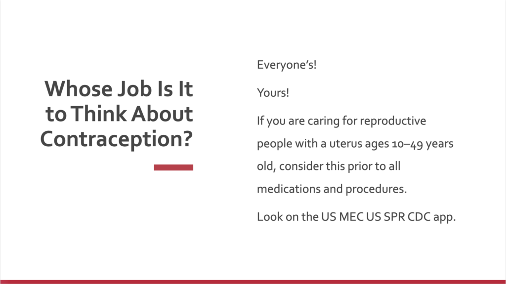
In short, the brain can’t rely on where the next line will be. The eye has to search for the location of the next line. Again, even that nanosecond of searching creates extra burden, which we want to remove if we can. Left-, or even right-, justified text is reliable. The eye just knows to go to the margin, so the brain doesn’t have to think about searching for it. Depending on the image, we might right-justify text next to an image to balance the visual and make the text easier to read.
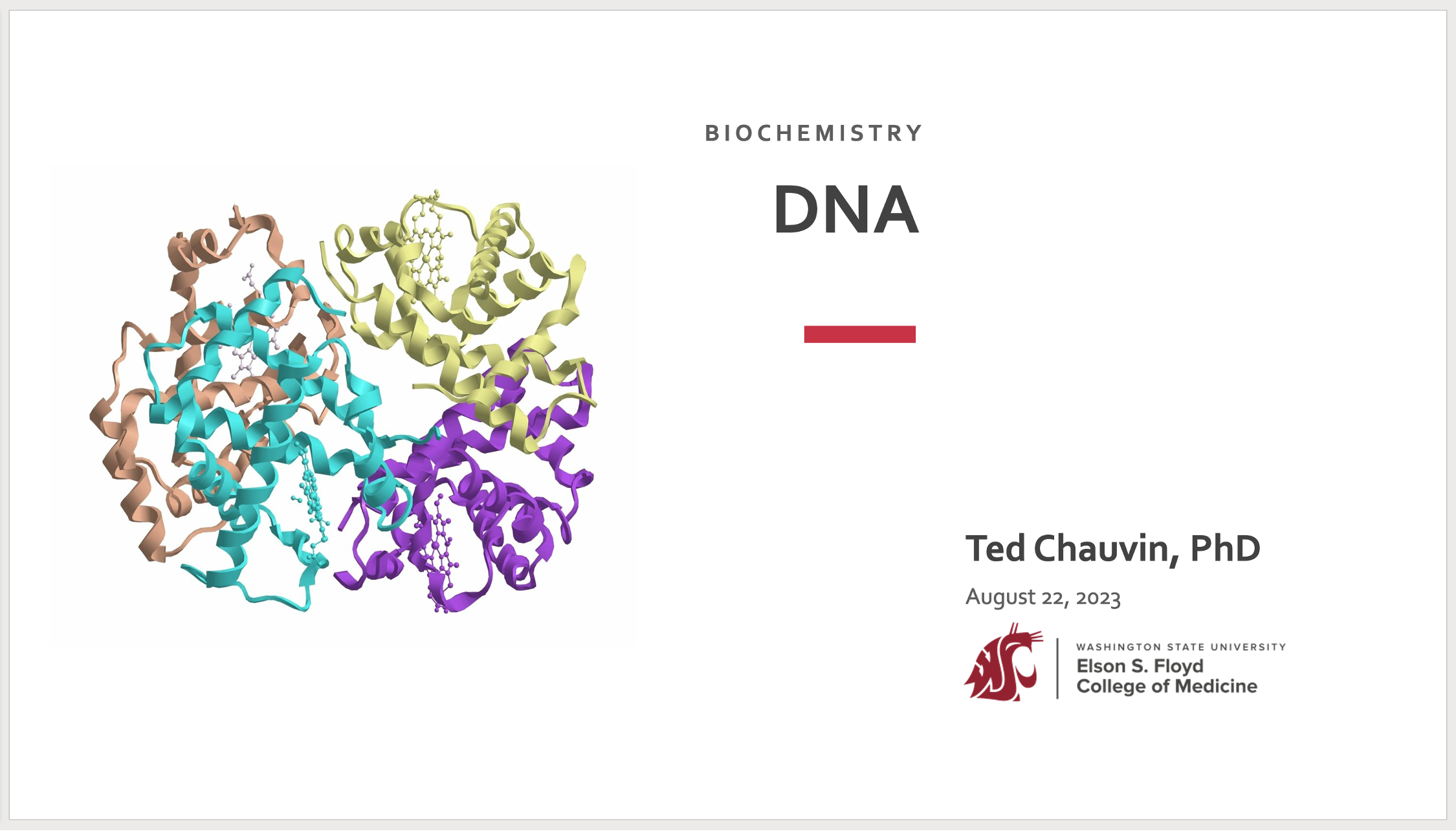
There is an image on the title slide. What is that for?


You’ll note the image pertains to a specific system or thread (each of which was chosen by the system or thread director). Some students organize their materials by picture icon in their Windows Explorer or Apple Finder folder trees. This way, the eye can scan quickly and distinguish a Neurologic slide deck from a Biochemistry deck, and so on. Also, it is an immediate, visual clue about the nature of the content, without the students reading the title text.
Keep reading for more details in Part 3!
Read more in this series
The Powerpoint template, part 1
To kick off our Instructional Design series, we want to introduce you to that most ubiquitous tool in our arsenal: the PowerPoint presentation.
The Powerpoint template, part 3
In this last installment, we are listing more of the features—and rationales behind them!—of the 2023 Powerpoint template.
