To kick off our Instructional Design series, we want to introduce you to that most ubiquitous tool in our arsenal: the PowerPoint presentation. Why? Because it is used in almost every session across the college, with a few exceptions. Faculty rely on it to deliver content because it is the most organisable and digestible tool, and students rely on it to know what content they are responsible for understanding.
But.
In the words of that great philosopher, Dwight Schrute, from one of the best cold opens in episodic television ever: “PowerPoint is boring.”
Once upon a time,
in higher education classrooms far, far away, students were using dummy computer terminals, researching information in library card catalogs, and organizing masses of paper they received in their classes. Professors came to class armed with transparencies that may (or most likely may not) have content on them, which was then beamed to the pull-down screen at the front of the room using a light bulb brighter than the sun and with a glare just as bad.
Education was “one size fits all” because few people understood learning styles or neurodivergence. Today, with new technology and tools at our disposal, we can support individual learning needs much more effectively.
Here at the College of Medicine, we have so many technology tools, applications, and methods for delivering information. It is a matrix of opportunities for students and faculty alike to pick and choose their preferred tools and delivery methods. In the coming months, we will be exploring the intersection of technology, learning, instructional design, and digital publishing with blog posts on the Medicine Digital Learning and MedTech websites.

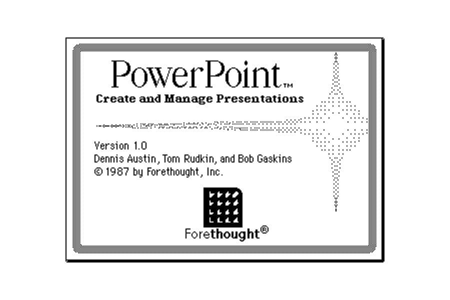
In 1987 (yes, nearly forty years ago!), Microsoft released PowerPoint into the world. It has been around for longer than some of us have been alive and has been is a staple in our educational and professional lives ever since.
But . . . why is it so . . . boring? (Hey, I work with it every day—I am allowed to poke fun!)
It doesn’t have to be.
After so many years, users have figured out how to optimize it. Educators and instructional designers still rely on it because it can be both effective and efficient. However, building a good presentation can be challenging, especially if one is in a hurry. Trying to meet the time and mental-energy constraints of the instructor with the demand for good content and delivery needs of the students is challenging. How can we support both?
This is the intersection of technology, instructional design and digital publishing. The united goal of instructional design, technology, and digital publishing is to marry great content with great design. We understand that for content to be used and absorbed by students, the content must be designed in such a way to make learning easier—not harder—for them.
PowerPoint is an under-appreciated delivery mechanism, which is a bummer because we rely on it so much. How do we make this less painful for our faculty, more useful for our students, and a more cohesive and consistent tool across the college?
Enter the new College of Medicine template
You may have heard (or seen) the new COM template that was rolled out across the pre-clerkship FMS sessions in 2023. Read more in this series for more details on some of the improvements we made—and why.
Read more in this series
The Powerpoint template, part 2
In Part 2 of our series, read on for some of the features—and rationales behind them!—of the 2023 Powerpoint template.
The Powerpoint template, part 3
In this last installment, we are listing more of the features—and rationales behind them!—of the 2023 Powerpoint template.
